Iron Maiden Album Art Countdown
by Erick Von Erich
With Halloween HavoK 2021, it's as good a time as any to jump into one of my favorite subjects: Iron Maiden album art! The band has a long and rich history filled with spooky, creepy, supernatural and Halloween-ish stuff, with not just their imagery, but with songs like "Murders in the Rue Morgue", "Twilight Zone", "Phantom of the Opera", "Fear of the Dark", "The Wicker Man" and even "Transylvania". Consider that the band's name itself is a borrowed from a spiked-filled medieval torture device, and it's suddenly surprising that it took me until the 11th edition of Halloween HavoK to get to this.
Founded in 1975 and officially releasing their eponymous debut album in 1980, Iron Freakin' Maiden has become synonmous with heavy metal, becoming one of the genre's biggest icons. While there have been great album covers for decades, Maiden really popularized the connection between a band and their artwork. In the 80's, Maiden "back patches" were all over headbangers' jean jackets. Whenever a Maiden album is released, a fan's first or second thought is: "what's the cover look like"?
For over 40 years now, the band's mascot, "Eddie the 'Ed", has gone through a series of depictions and evolutions on their album covers and any other piece of artwork or merchandising associated with the band. Eddie has become one of the most recognizable figures in music history. In fact, my sister-in-law owns a t-shirt of Maiden's "The Trooper", purchased at either Wal-Mart or Hot Topic, I'm sure. She's never actually heard the song...and can't name more than 2 Maiden tunes, overall... but she has the shirt simply because "it looks cool".
Originally a big paper-maiche head (or 'ead when pronounced with a thick British accent), Eddie would pop-up behind the drum kit during the band's shows and spit blood. He was supposed to spray the audience, but usually he just ended up gurling fake plasma onto the drummer. The band was eventually asked to provide some background on Eddie and guitarist Dave Murray offered up the following explanation:
"A wife had a baby, but it was born with only a head and no body. 'Don't worry,' says the doctor. 'Bring him back in five years time, and we'll probably have a body for him'. So five years go by, and there's Eddie the 'Ead, as his parents have called him, sitting on the mantelpiece, when in walks his dad. 'Son,' he says, 'today's a very special day. It's your fifth birthday, and we've got a very special surprise for you.' 'Oh no,' says Eddie. 'Not another f*cking hat!'"
A few years later, the band met artist Derek Riggs, who became synonymous with the band due to his renderings of Eddie. In fact, Riggs' signed all his Eddie artwork with a mysterious glyph or symbol. For years, (mostly US) fans thought this was some sort of code or icon to signify the band, as it unintentionally became "the Iron Maiden symbol".
As a big Maiden since 1982, and a creative professional since 1994, I thought it might be fun to go back and rank their album artwork. They just released their 17th studio album, "Senjutsu", so the time is ripe. For the purpose of this countdown, I'm sticking only to the studio albums. So this excludes their live albums, EPs, compliations, singles, tour artwork, and other oddities. Which is kind of a bummer, because the cover to "Maiden Japan" is one of my favorite pieces, as is the single artwork for "Flight of Icarus". Don't fret though, with 17 albums, we'll cover a lot of ground. But hey, enough of my yappin', let's rock!
17. Dance of Death (2003)
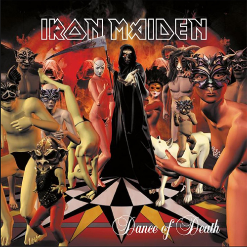
No surpise here (and honestly, my #1 will not be a surprise either), as this is considered not just the worst Maiden album cover, but worst Maiden image ever. It's like somebody used a Free Clip-Art CD from 1996 and mashed it all together with the old Poser program. So much going here and a lot of it is out-of-scale and on different persepctive planes. The band claims that a miscommunication led to the abyssmal art, and you have to believe them.
16. The Final Frontier (2010)
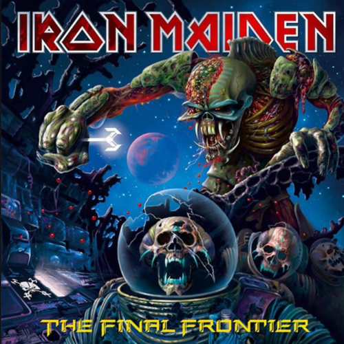
If it weren't for the Iron Maiden logo, you'd think it's a generic monster image. The logo makes you think: "oh yeah. Maiden. I guess that's Eddie". Personally, I think the creature looks more like the Ghost Rider villain, Venegance, circa 1993. There's nothing really distinctive, here, and it takes a second or third look before you notice the astronauts at the bottom. I'm also mystified on what that glowing screwdriver-thingie is supposed to be.
15. Virtual XI (1998)
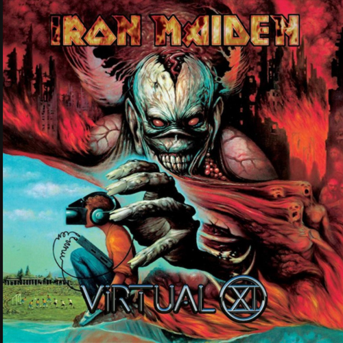
The "Blaze Bayley Years" were the nadir of Maiden's career. The metal nostaligia boom hadn't kicked in and they came off like detached dinoaurs, well removed from their prime. Along these lines, Eddie appears to be well removed from his prime, as he looks more like a zombified version of Batman's arch-enemy, the Joker. Plus, look at those EARS. Then top it off with a little goober plugged into a virtual reality machine in the bottom left. Again, were it not for the band's logo, you wouldn't recognize this as part of their brand.
14. Senjetsu (2021)
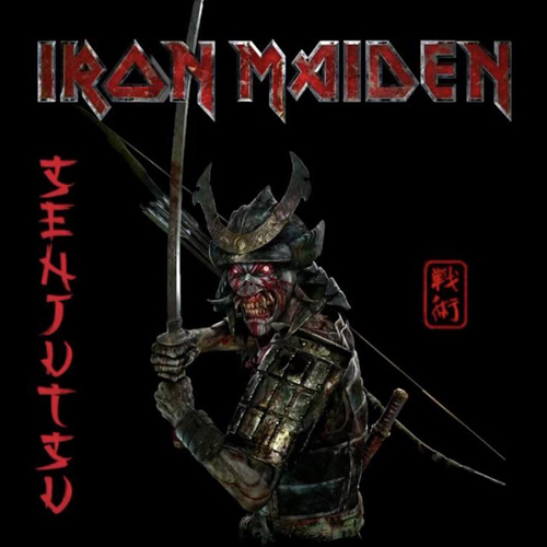
Maybe this will rank lower, as time goes on. Derek Riggs once said that he began to get fed up with Maiden becuase they were simply looking for "Eddie as a cowboy", "Eddie as an astronaut", or "Eddie as a chef". He felt they were lacking in originality and just finding new costumes or gimmick to slap Eddie into. Almost like Eddie was cycling through the Village People's wardrobe. This definitely qualifies, as it's basically "Eddie as a samurai".
13. The X Factor (1995)
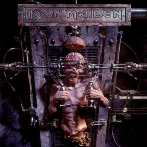
Get it? X as in TEN?! See..."X" is the Roman numeral for ten and this was Maiden's TENTH album. But I may be going too fast for ya'. This is seemingly another random image, yet it does call back to the classic 80's images. Most notably "Piece of Mind", as Eddie's being experimented or operated on. This was also the first time they ventured away from traditional artwork and into photo-realistic work. As it was the first album of Maiden's new era with Blazy Bayley, it helped to establish a give a sense of "new-ness". Yet the album was complete rubbish. To this day, I have never been disappointed by ANY album, as much as I was in 1995 when I got home and put this into my CD player."I know you don't like X FACTOR, but why you gotta' look at me like that...."
12. Iron Maiden (1980)
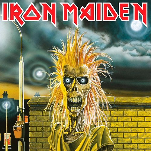
Yeah, yeah... it's a classic image, and this may be blasphemy to some. This was Derek Riggs' first foray into the world of Maiden and the original title of this was "Electric Matthew Says Hello". Supposedly, this was initially intended for a punk cover. Sure, early Maiden had a bit of that punk look, especially with Paul Di'anno as their frontman. However, as this wasn't originally intended for the band, it's sort of "sloppy seconds" and doesn't really fit with their image. You'll note that Eddie has a more slender look and his mouth is gaping vacantly, and doesn't really look sinister. There was even some debate amongst fans in the 80's that this wasn't actually Eddie, but a completely different monster. However, it didn't take long for Eddie to fill out. Almost instantly, Riggs refined Eddie and the iconic look of the mascot was established within a few months. Like a lot of metalheads, I liked to create my own fictional history for Eddie, and figured that this was early on in his career. He soon ate/attacked/killed more people and began to bulk up.
11. Seventh Son of Seventh Son (1988)
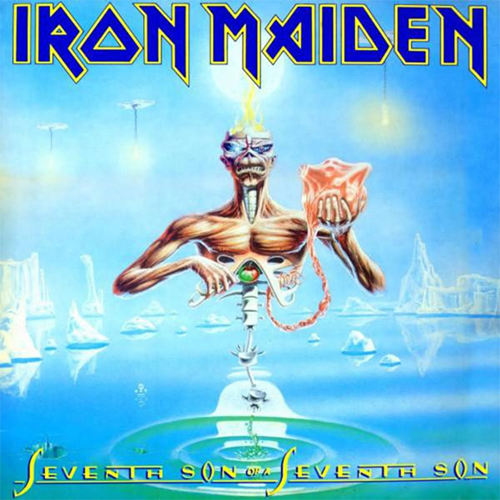
Another "classic" that I don't rate as high as most. Namely because the choice of colors evokes a softness or pleasantness. Heck, the blue/yellow/white scheme matched my old Cub Scout uniform. It almost seems like it's a leftover image from a YES or Asia album cover. And does Eddie appear to have had an "baby"? Awwww. Again, in my personal Eddie history, I figued he'd been torn apart, dissected and lobotomized, became a god, turned into a robot, then finally found some mystical way to be reborn... which may have been a set up for "No Prayer for the Dying". While the look of this album did result in a nifty multi-level ice sculpture stage set, it never really lit me on fire.
10. No Prayer for the Dying (1990)
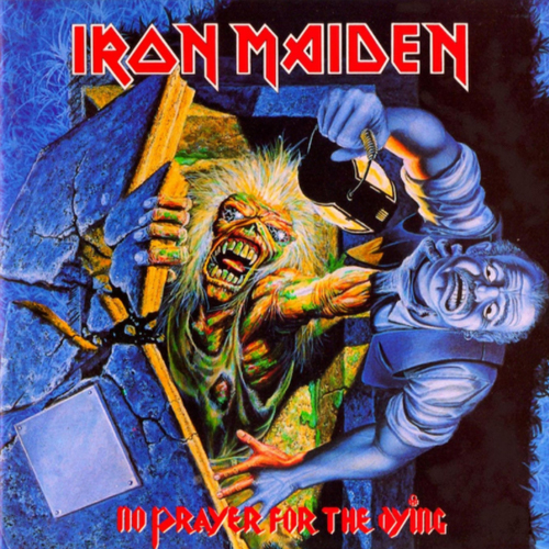
After the flash and extravagance of the 80's, Eddie and the band seemed to get "back to basics" at this time. Even their stage show was scaled down, from multi-level castles or spaceships to a simple row of Marshall stacks. However, this comes off looking more like the artwork for a single or EP, rather than a full-on album. The back of the cover continues with sort of graveyard or even Halloween theme. While it ties in with the "back to basics" theme as Eddie appears to have been reborn, it is rather ordinary for what he'd been through, the previous 6 or 7 years. Then add in the somewhat cartoonish old man being choked and it's another "yeah, I guess it's okay, cuz' it's Maiden" offering. I have a tour shirt from this era, of Eddie with a metal claw, attacking a new victim. I would've preferred that image for the cover, but it's splitting hairs and we're getting into the secondary artwork (which I may cover for Halloween HavoK 2022).
9. Brave New World (2000)
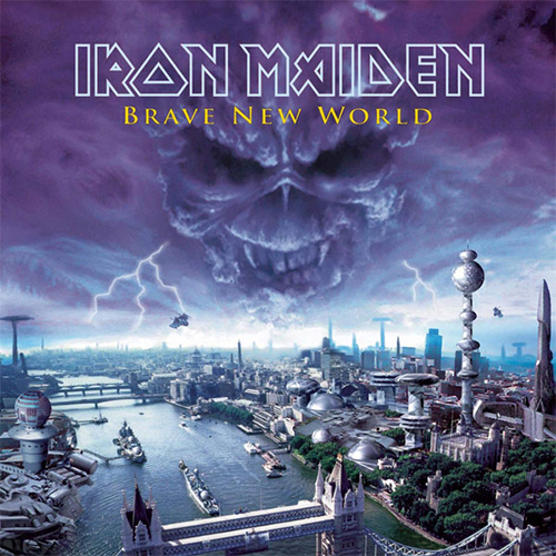
Maiden's big comeback/reunion album and while it turned a whole new generation on to the band, the image doesn't really focus on Eddie. It's just...Eddie in the clouds in a Photoshop piece. It does score some points as the main subject appears to be a futuristic version of London, thus selling the whole "Brave New World" concept. Also, the more I think about it, the vibe of "Eddie is watching over all" IS rather creepy.
8. Powerslave (1984)
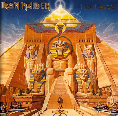
One of the most complex Maiden covers, rendered with a draftsman-like quality. Once again, it's "Eddie as a _____", yet the other details make up for it and add to the presentation. Fun bonus about the full-size ALBUM cover (nearly impossible to spot on the CD, tape or even Streaming Service Album Art), zoom in on the lower-left side of the pyramid complex and you can see some ancient graffiti that reads: "Indiana Jones was here".
7. Fear of the Dark (1992)
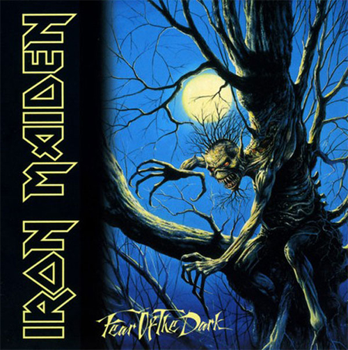
Arguably the last album of Maiden's "classic" era (or the second of their "transitional" era, depending on how you see things) and the first album cover NOT rendered by Derek Riggs, rather by Melvyn Grant. The exclusion of Riggs created quite a bit of worry among fans, but it was quelled when Riggs returned for the band's 1993 live albums. Following up on "No Prayer", this is a bit of a throwback to a generally spooky/Halloween-ish/horror-ish image of Eddie moprhed with a tree. It reminds me of the scene from "Poltergeist" when a shdadowy tree comes alive and tries to eat little kids. It gets Eddie back to his scary roots (no pun intended, but appreciated) as a monster and not a dress-up doll.
6. A Matter of Life and Death (2006)
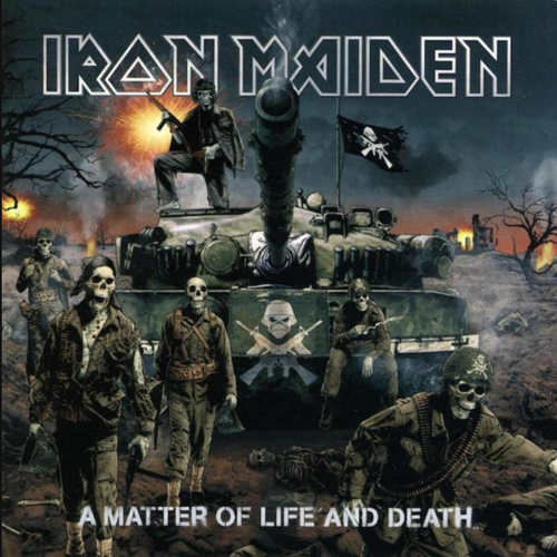
After the stench of 2003's "Dance of Death", Maiden needed some cool imagery (and tunes) to get back into the good graces of metalheads. This nailed it, as Eddie is commanding an army of undead skeletons....and, oh yeah, he has a frickin' TANK. It was done by US artist Tim Bradstreet, who had a background in movie posters and comics. It always reminds me of the cover to Marvel Comics' GI Joe #1 from 1982, but twisted through a Maiden Filter. This also includes the cool logo of Eddie's face over crossed rifles. If I could find a shirt that had just that logo, I'd be down for dropping some cash.
5. The Book of Souls (2015)
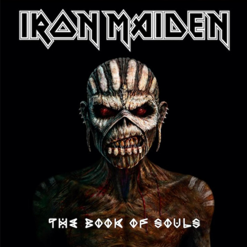
I might be ranking this higher simply because I consider this Maiden's best post-2000 album. It's another "Eddie as a _____" cover, but it works. They hadn't really gone full-on with the costumed Eddie gimmick since the 80's, so it turned out okay. The inside album artwork spread then featured some gory images of "Maya Eddie" that harkened back to the "Killers" era. Had this been released in the 80's, the interior spread probably would've been the cover. Considering the era and that most "Album artowrk", nowadays, is seen on a small digital screen, it made sense to have such a simple cover.
4. Piece of Mind (1983)
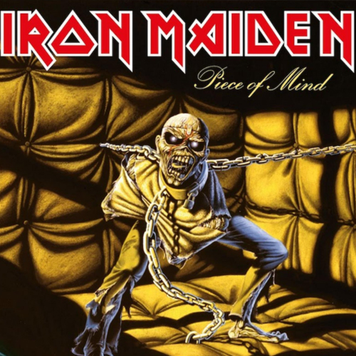
Probably the punniest album title in metal history. Where did that "piece" come from? Eddie himself! The band's even dining on Eddie's removed cerebellum on the interior photos! Looking like a nightmare, this screaming depiction of Eddie also sports several new additions to the character: he now has a shaved head, a prominent scar where he was cut open, and a BOLT that keeps his head together. He'd maintain the bolt until the 90's. Adding to the fun is that this album featured the debut of new drummer Nicko McBRAIN (yes, that's his real name). Nicko is a funny, easy-going, dude and you have to wonder if it's coincidence that the band beagn publicly showing its sense of humor, more, once he came on board.
3. Killers (1981)
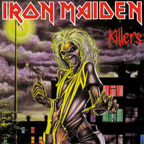
First time I saw this album cover, I was "meh". I thought it was just Eddie posing. Then I saw that he's actually KILLED someone, as the title indicates, and they're pulling at his shirt with their dying breath. He's not a friendly mascot you can dress up...Eddie will flat-out murder you with a hatchet! This was also the first album cover to feature Eddie's signature look, so as time went on it became more prominent. No flash, ruffles, or gimmicks; it's just Eddie being Eddie.
2. Somewhere in Time
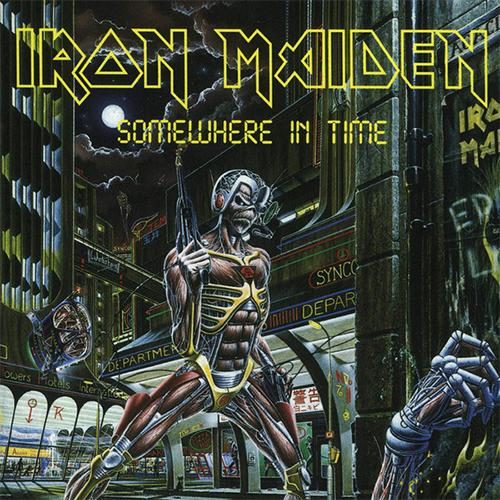
Yes, I kinda' poop on the "Eddie as a ____" covers, but this one dives SO deep into the gimmick that it's amazing. Eddie doesn't just have a hat or costume, he appears to have been rebuilt, on a molecular level, as a bounty-hunting cyborg! he has built-in weapons, armor, maybe even enhanced vision....he's a completely bad-*sss comic book villain (or anti-hero). Like the Terminator meets Marvel's Deathlok. A complete upgrade for Eddie with a very intricate design. The cover image can be cosidered a sequel to "Killers", complete with the grasping hand and the city street. The back of the album continues the complexity, as it's a futuristic street-scape, with several references to the band's history (including the Ruskin Arms club, which also appeared on the "Killers" art). Dr. Who's TARDIS and Batman even make appearances. I also rank this very high because the "Somewhere on Tour" show was the first concert I ever attended. Not just first Iron Maiden concert...FIRST CONCERT. I jumped head-first into the deep end.
1. Number of the Beast (1982)
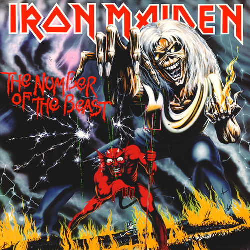
Like I said, no surprise. Probably one of the scariest, creepiest and most iconic album covers ever. You know who's evil? The DEVIL! But you know who's more evil than the devil, so much that it's cool? EDDIE! A lot of folks would see this album cover in the 80's and instantly scream "EEEK! It's SATAN" and deem this EVIL. Which makes it all the funnier that, in plain view, Eddie is actually overcoming evil by controlling and mastering the Devil. And hey, if you dig deeper into the Maiden single artwork, you'll know that Eddie acually fought the devil with a hatchet and chopped his bloody head off!
Why'd You Type This?
If you've followed our ramblings over on Da' Board, you've probably heard me babble about a fateful Sunday morning in 1982. My brother and I turned on TV and caught our first taste of pro wrestling (courtesy of the AWA) and then, about an hour later, caught the local PBS channel's music video show...which featured Iron Maiden's classic "Run to the Hills" video. I was hooked on both. Like I said, it was a fateful morning, because had I not seen those two shows, my life might've been different and I might not be here in 2021 typing on a pro wrestling site about Iron Maiden. So, let's Up the Irons as we celebrate Hallowen HavoK 2021!
Comment about this article on Da' Wrestling Boards!